Championing a Unified Brand to Elevate Seattle’s Sports Identity
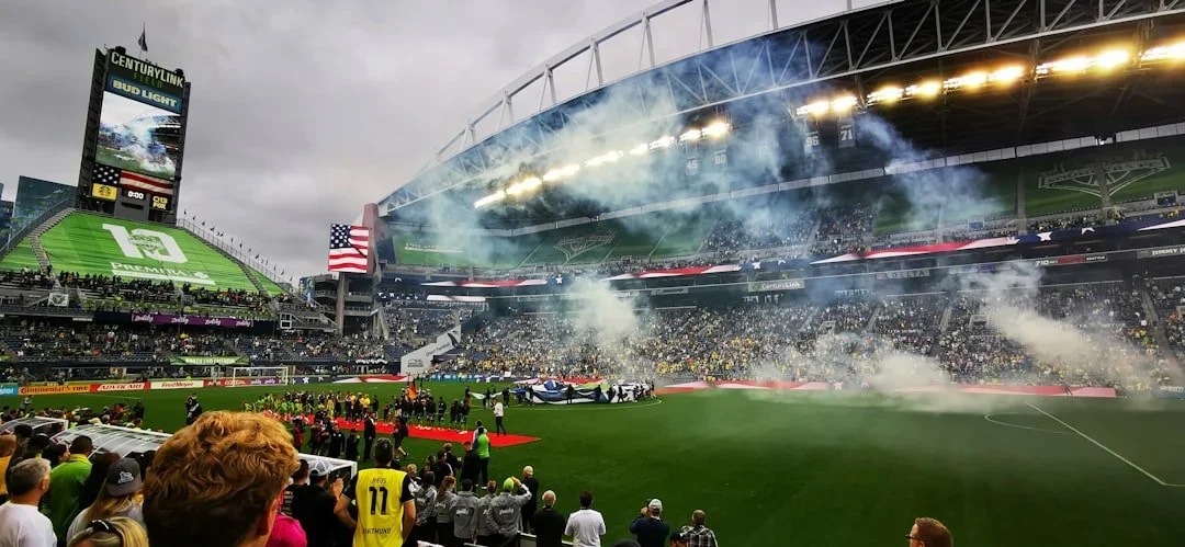
The Seattle Sports Commission champions the transformative power of sports to inspire, unite, and elevate the Greater Seattle region. As the organization’s role expanded across events, partnerships, and community initiatives, their identity needed to reflect not just what they do, but the energy, passion, and civic pride woven into Seattle’s sports culture. ANEWBrand partnered with the Seattle Sports Commission to reimagine a brand system that more clearly communicates their purpose, strengthens flexibility across extensions, and supports long-term impact for athletes, fans, partners, and the community.
Industry
Sports / Destination Branding / Community Engagement
Challenge
Translating a broad organizational mission into a unified, flexible brand system
Solution
Brand Strategy, Identity System Architecture, Nomenclature Framework, Visual System
Objectives
We aligned with leadership to define measurable goals for the engagement:
Clarify a strategic brand foundation that reflects the organization’s mission and Seattle’s vibrant sports ecosystem
Design a flexible identity and nomenclature system to support multiple events and initiatives without dilution
Establish a visual and verbal language that feels energized, bold, and rooted in place
Increase brand consistency across physical and digital touchpoints

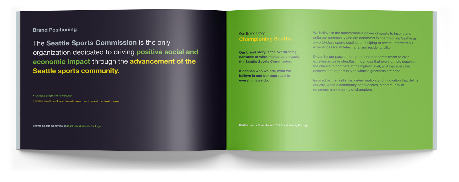
Brand Strategy & System Architecture
We began by rethinking what a sports commission brand could be. Beyond visual refresh, the strategy centered on building a foundation that supports breadth — from signature events to partner integrations — while maintaining a cohesive voice anchored in the power of sport, community, and experience.
Messaging Designed for a Diverse Sports Community
The new messaging framework balances passion with purpose, elevating the Seattle Sports Commission’s role as both advocate and connector. The language reinforces unity, economic impact, and celebration of Seattle’s athletes and fans — creating a narrative that resonates across stakeholders and touchpoints.
Visual Identity That Reflects Energy and Place
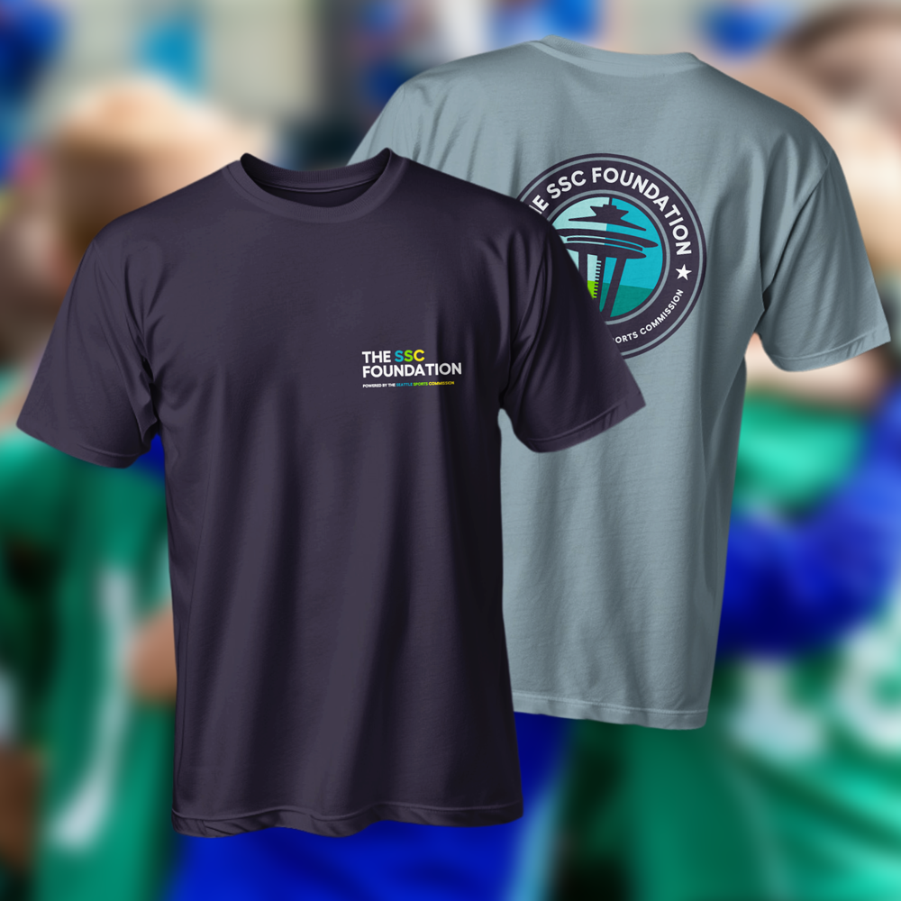
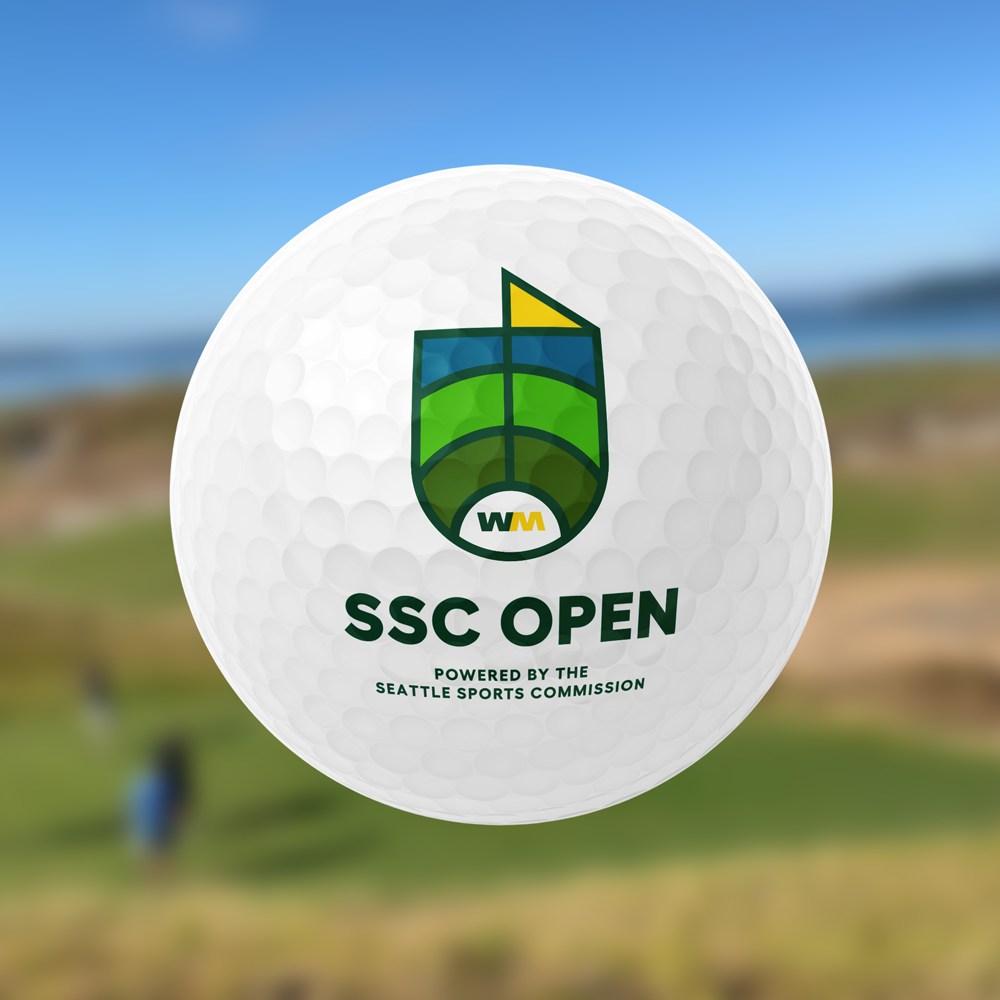
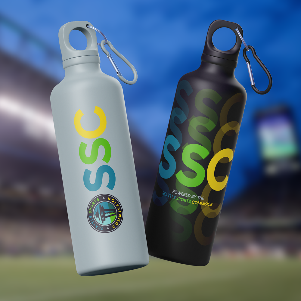
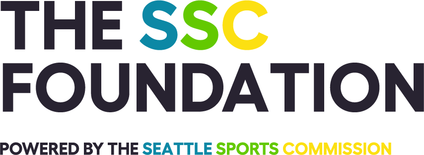
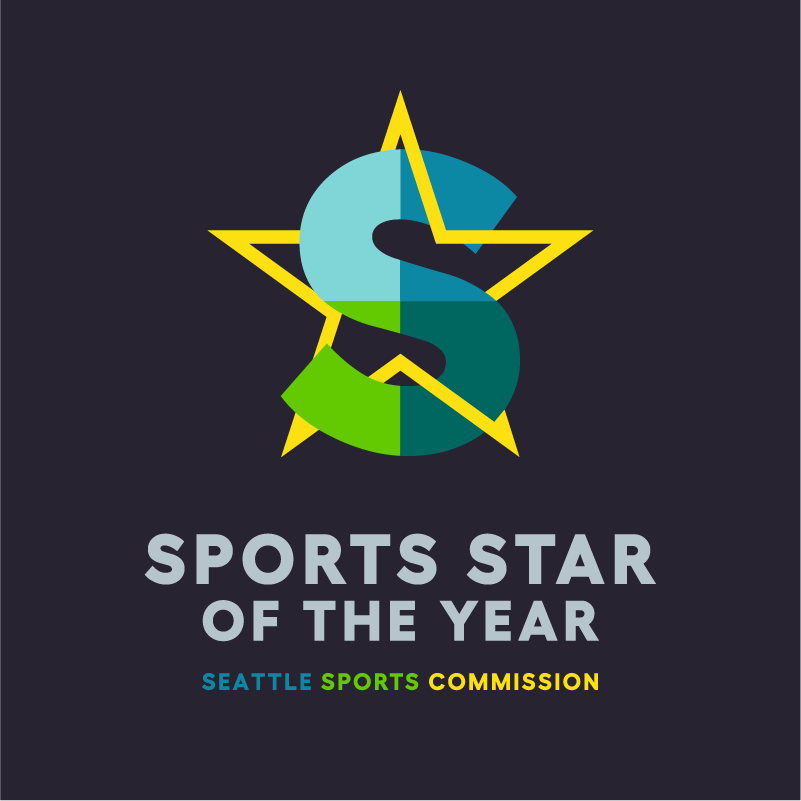
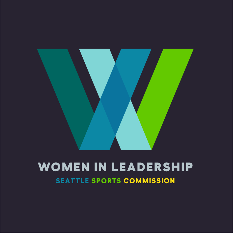
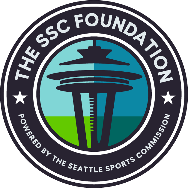
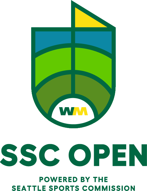
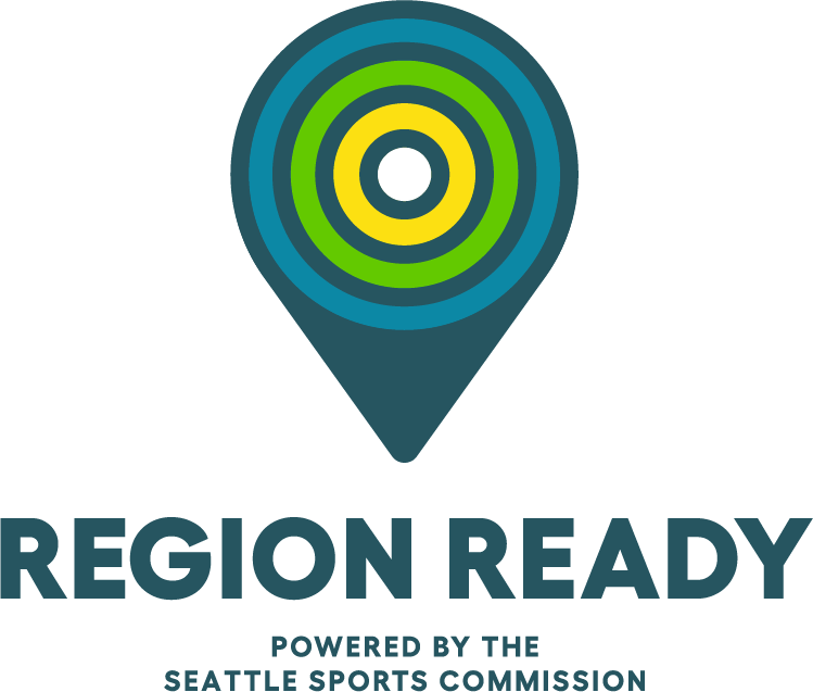
With multiple events and initiatives operating under the Seattle Sports Commission umbrella, the visual identity needed to function as a system rather than a single mark. We architected a cohesive nomenclature and design framework that allows each individual brand to establish its own distinct identity while remaining clearly connected to the SSC parent brand.
This approach enables greater market flexibility, supports future growth, and reduces the risk of brand dilution across diverse brand extensions. The system includes a family of logos, consistent visual rules, and adaptable design elements that scale across events, partnerships, and platforms while maintaining clarity, energy, and cohesion.
FONT

COLOR
Emerald Bay
#63b0a5
Night Blue
#272330
Storm Sky
#3d86a2
Field Green
#7dc73b
Clear Sky
#94d4d5
Bay Green
#2a6460
Champion Yellow
#f7e14e
Results
“The team at ANEWBrand brought a thoughtful and creative approach to our rebranding journey, and most importantly, they demonstrated a commitment to a successful result that met our expectations.”
Beth Knox, CEO | Seattle Sports Commission

Want to Transform Your Brand Like Seattle Sports Commission?
Let’s talk about how strategic branding can amplify your mission and strengthen connection with your audiences.