Strengthening Brand Clarity to Better Serve People and Communities
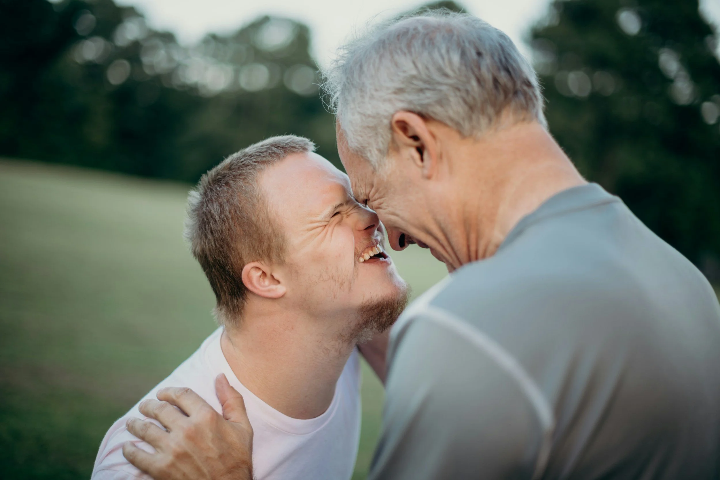
JARC Detroit has spent decades providing compassionate, person-centered services for individuals with developmental disabilities. As their impact grew and their audiences diversified, the existing brand no longer communicated who they truly were or what they stood for. ANEWBrand partnered with JARC to clarify their strategic positioning, unify messaging, and shape a visual identity that reflects the organization’s heart and purpose.
Industry
Nonprofit / Human Services / Disability Support
Challenge
Evolving a Legacy Brand to Reflect Growth, Clarity, and Connection
Solution
Brand Strategy, Messaging Framework, Visual Identity System
Objectives
We aligned with JARC leadership to define measurable goals for the project:
Create a cohesive messaging platform that resonates with families, donors, and partners
Refine brand positioning to reflect JARC’s values, impact, and future direction
Design a flexible identity system usable across digital, print, and environmental touchpoints
Develop a web experience that is clear, accessible, and welcoming
Brand Audit & Positioning Framework
We began by examining JARC’s existing narrative, voice, and visual systems to uncover strengths and gaps. This audit informed a refined positioning platform rooted in clarity, compassion, and connection.
Messaging System Designed for Multiple Audiences
We developed a clear messaging architecture that balances practical information with emotional connection. The system speaks to services, programs, and support pathways while also reinforcing trust, belonging, and community. It creates consistent language that works seamlessly across fundraising, recruitment, and outreach, giving Jarc a unified voice across audiences and touchpoints.
Visual Identity Grounded in Purpose
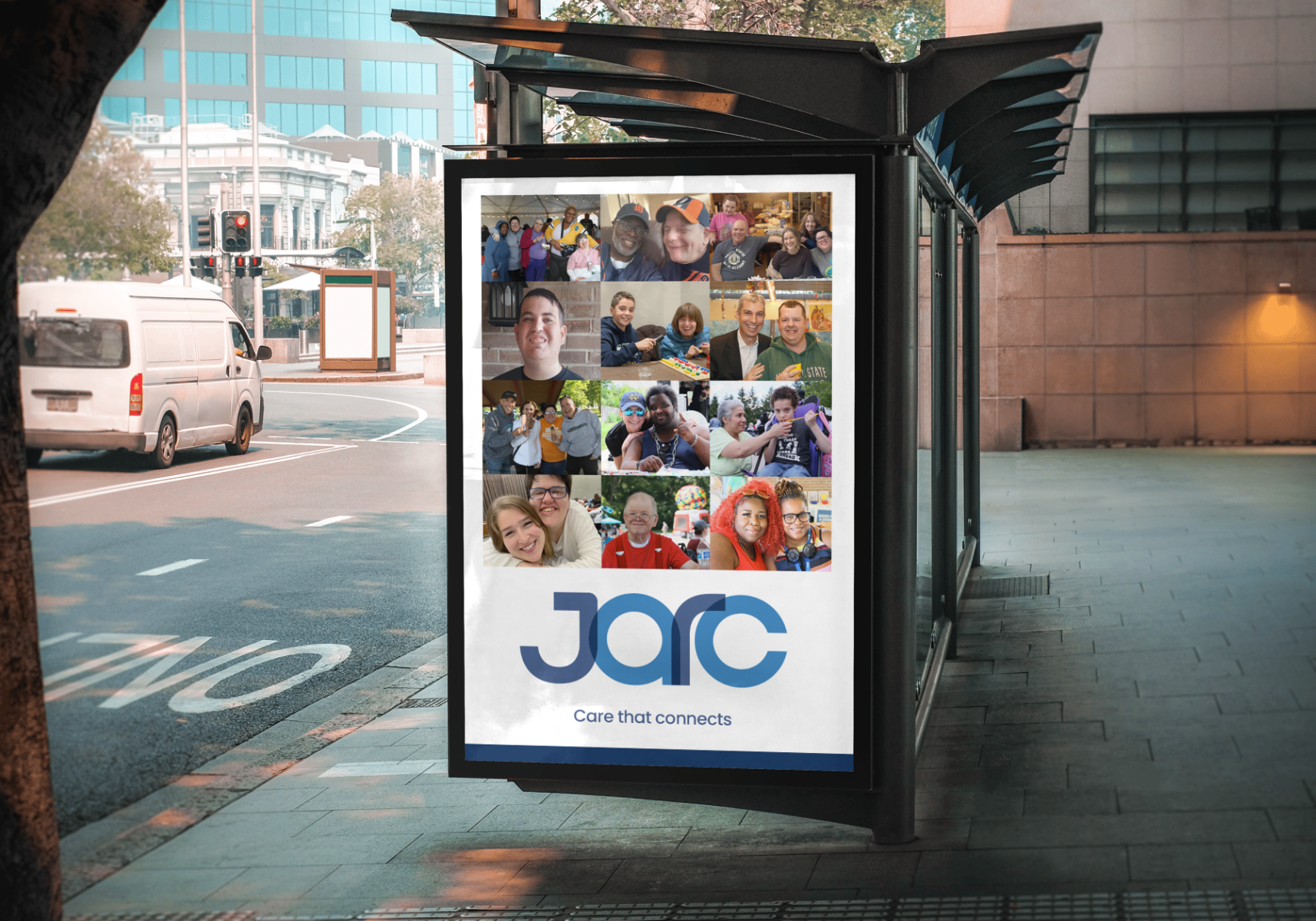
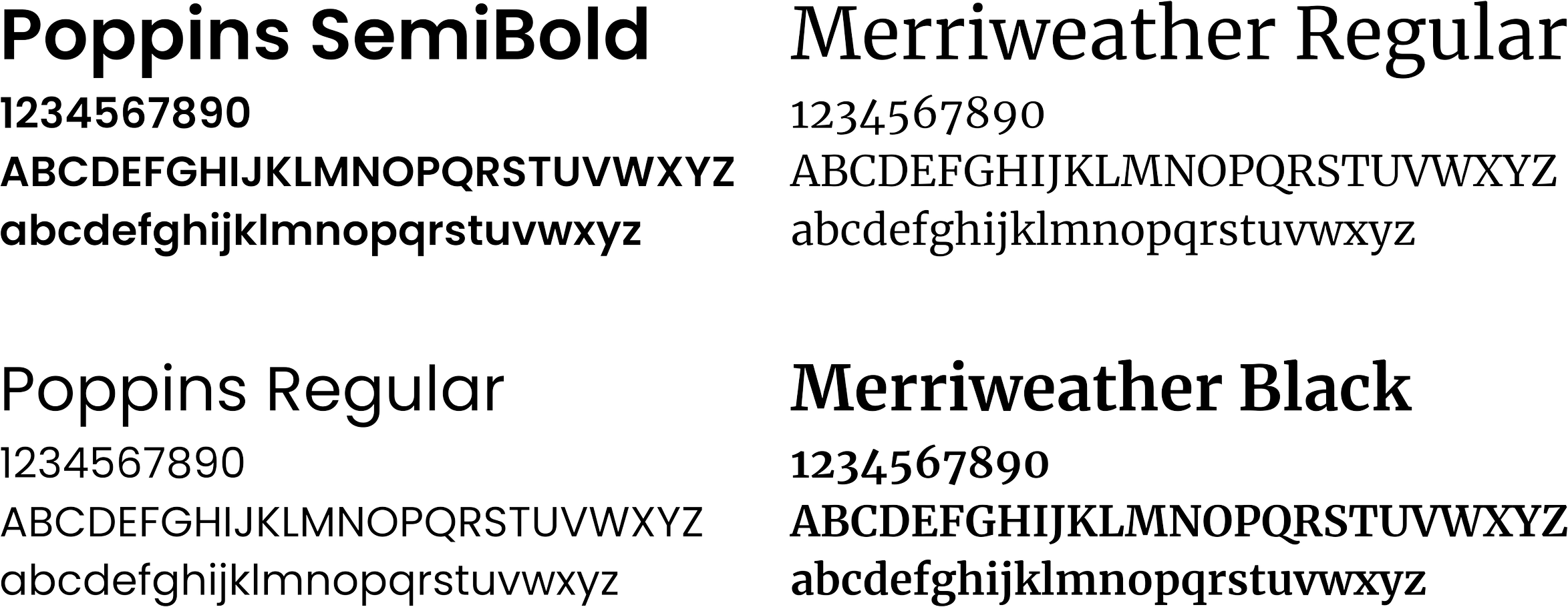
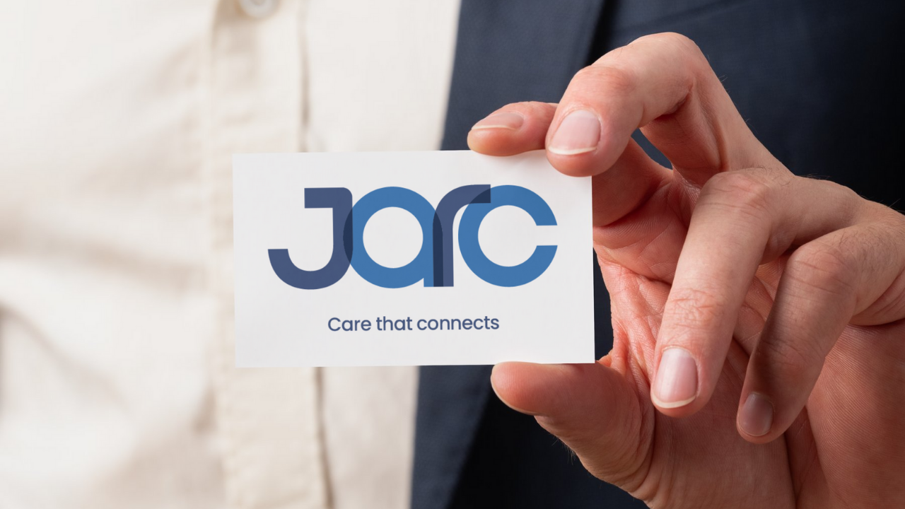
The visual identity balances warmth and professionalism to reflect Jarc’s mission and values. We refined the name styling for a more approachable feel, introduced a mark inspired by connection and support, and built a color palette rooted in dignity, trust, energy, and inclusivity. Paired with an accessible typography and layout system, these elements form a flexible identity that scales effortlessly from donor communications to digital experiences.
FONT
COLOR
Foundation Navy
#0F244C
Harmony Aqua
#43878B
Resilience Green
#9CC556
Spirit Orange
#F9913D
Results
“Roger, Steven, and the entire ANEWBrand team have been the best possible partners in our brand evolution. They deeply understand our work and our community and seamlessly integrate that into all aspects of our brand. They aren’t just designers and programmers either – they are thoughtful, know how to work with people and expertly manage relationships and expectations. I couldn’t be happier with our experience with ANEWBrand.”
Jacob Gottlieb: COO | Jarc

Want to Transform Your Brand Like JARC?
Let’s talk about how strategic branding can amplify your mission and strengthen connection with your audiences.