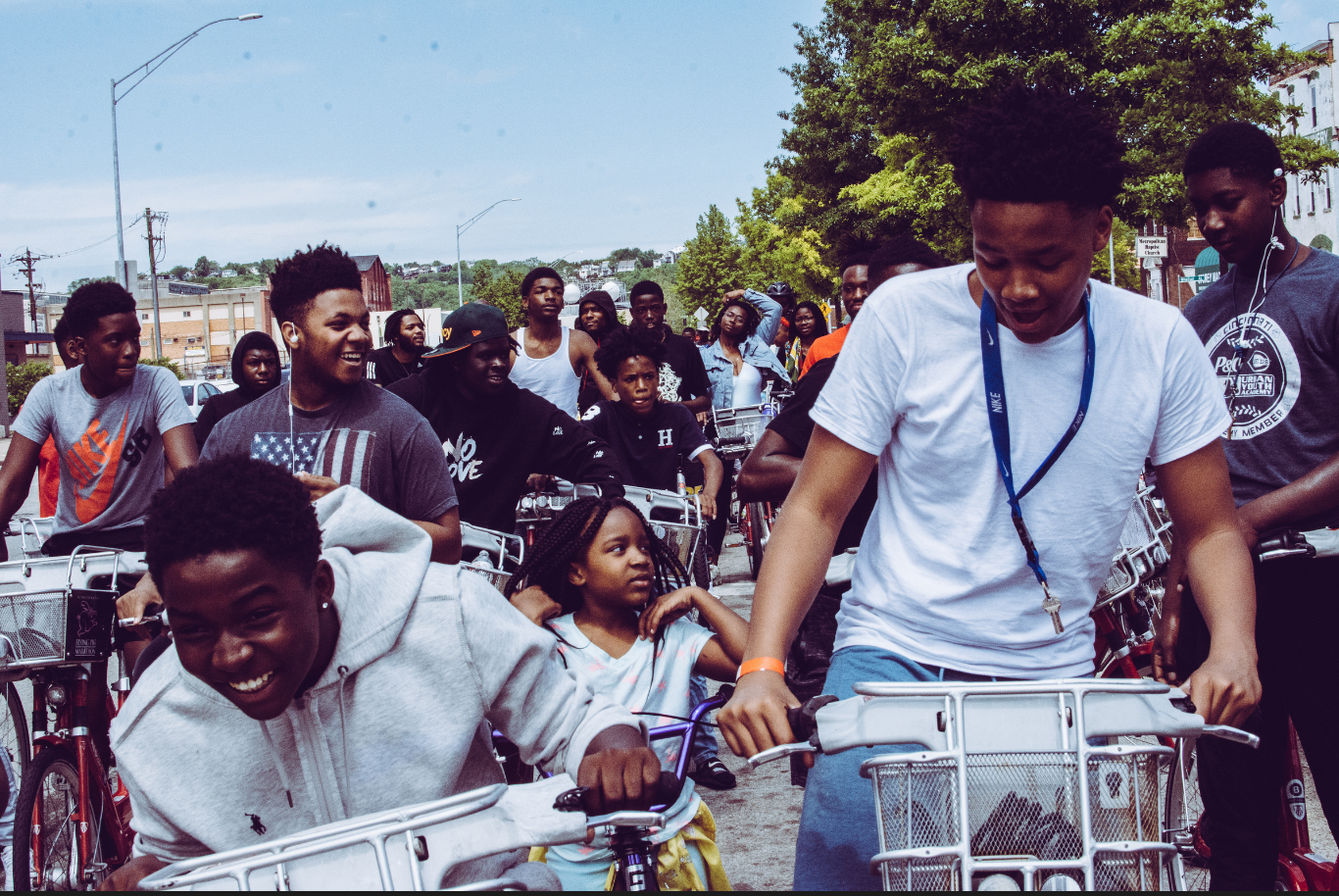
Putting Community Truth on the Record to Drive Real Change
For The Record is a statewide, community-powered initiative created to document lived experience and turn it into action. Built in partnership with Zibolsky Consulting and Byrd Barr Place, the campaign centers Black Washingtonians while remaining open to all, creating space for people to speak honestly about what’s working, what’s broken, and what needs to change. ANEWBrand partnered with the For The Record team to shape a clear positioning, bold messaging system, and unapologetic visual identity that invites truth telling at scale and ensures those voices cannot be ignored.
Industry
Nonprofit / Community Engagement / Public Policy
Challenge
Translating lived experience into a bold, trustworthy public record
Solution
Brand Strategy, Messaging Framework, Visual Identity System, Campaign Design
Objectives
Create a community-centered brand that prioritizes voice over process
Develop messaging that is direct, honest, and rooted in lived truth
Design a visual system that feels bold, human, and unapologetic
Build a campaign framework that supports participation, trust, and long-term impact
Brand Positioning & Strategic Foundation
At its core, For The Record is not a survey. It is a declaration. We established a positioning platform that reframes data collection as collective truth telling, shifting power back to the community. The strategy centers lived experience as expertise and positions participation as an act of agency, not compliance.
Messaging System Built for Truth and Action
We developed a messaging architecture that is clear, confident, and collective. The voice is grounded, direct, and protective, intentionally rejecting polished or institutional language. Messaging pillars such as Voice is Power, Truth on Record, and From Insight to Impact ensure consistency across outreach, partnerships, and campaign materials while reinforcing trust and accountability.
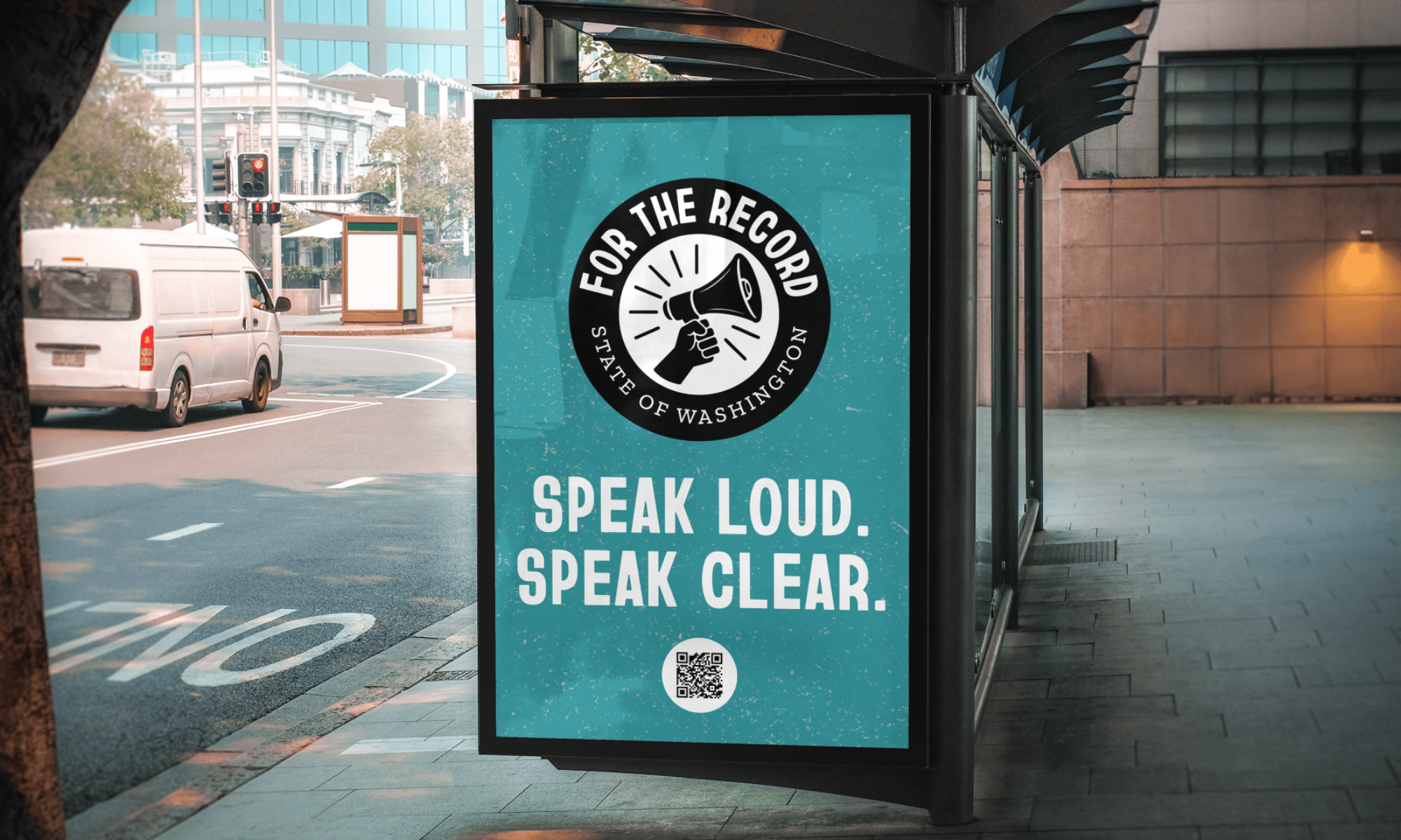
Visual Identity Grounded in Voice and Presence
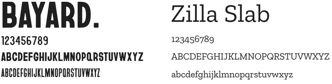
The visual identity draws from protest culture, community history, and collective momentum. A bold logo system built around the megaphone symbol reinforces amplification and agency, while a flexible set of marks allows the identity to scale across platforms and applications. Typography inspired by civil rights-era signage and a color palette rooted in culture, dignity, and energy work together to create a system that demands attention while remaining human and accessible.
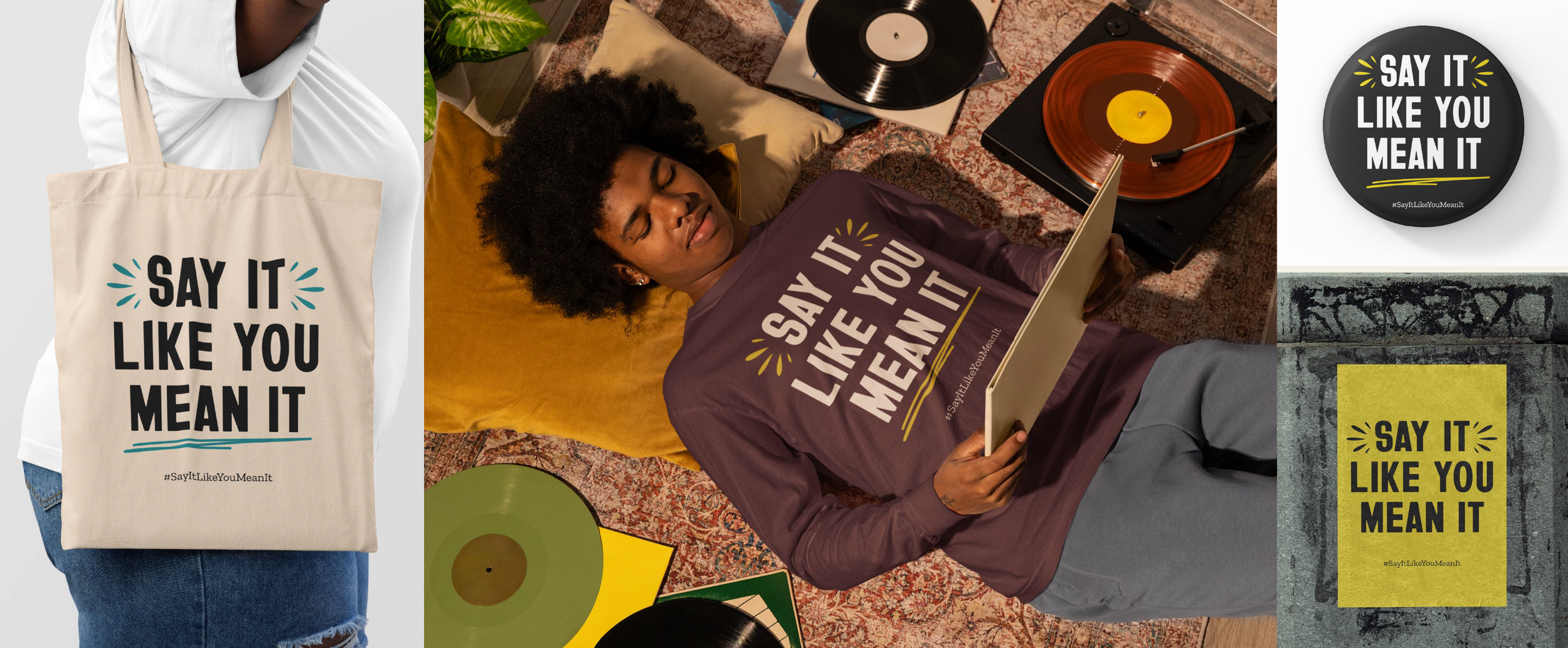
Campaign System Designed to Mobilize
We brought the brand to life through the Say It Like You Mean It campaign, a rallying cry that invites honesty without apology. From social and email to signage, merchandise, and digital experiences, every touchpoint reinforces participation as power and positions community voices as the catalyst for policy, program, and resource change.
FONT
COLOR
Soundwave Teal
#4c9197
Ash Black
#191919
Legacy Maroon
#452331
Joy Gold
#d2be49
Canvas Light
#f4f3e9
ICONS
Results
“Working with ANEWBrand was transformative. They developed a clear campaign identity — name, tagline, and messaging pillars — that resonated across audiences and aligned with our values.”
Chelsea Amable-Zibolsky, CEO

Looking to build a brand that can scale without losing its soul?
We help organizations turn mission into clear, cohesive brand systems.