Where Sacred Meets Now
Emanu-El B’ne Jeshurun wasn’t facing a relevance problem. It was facing a clarity problem. As a Reform Jewish congregation with deep roots, the challenge wasn’t tradition, but perception. For some, synagogue life felt too rigid. For others, too undefined. Too old, or trying too hard to be new.
ANEWBrand partnered with Emanu-El to reset the brand around a clear, human tension, creating a system that honors legacy while confidently showing up for today.
Industry
Faith / Community / Nonprofit
Challenge
Clarifying identity without diluting tradition
Solution
Brand Strategy, Naming & Platform, Visual Identity System, Website UI Design
Objectives
We aligned with Emanu-El leadership to define clear goals for the reset:
Clarify who Emanu-El is for and how it shows up in the world
Reframe synagogue life as accessible, meaningful, and invitational
Preserve legacy while signaling relevance and forward momentum
Create a brand system that supports programs, communications, and growth
Strategic Reset
The work began with a reset, not a reinvention. Emanu-El wasn’t losing relevance. It was losing clarity. Through discovery, we identified a core tension that became the foundation of the brand:
Meaning without pretense.
Tradition without barriers.
Connection without conditions.
This framing gave the congregation language to confidently articulate its values, its openness, and its role as a spiritual home grounded in authenticity rather than performance.
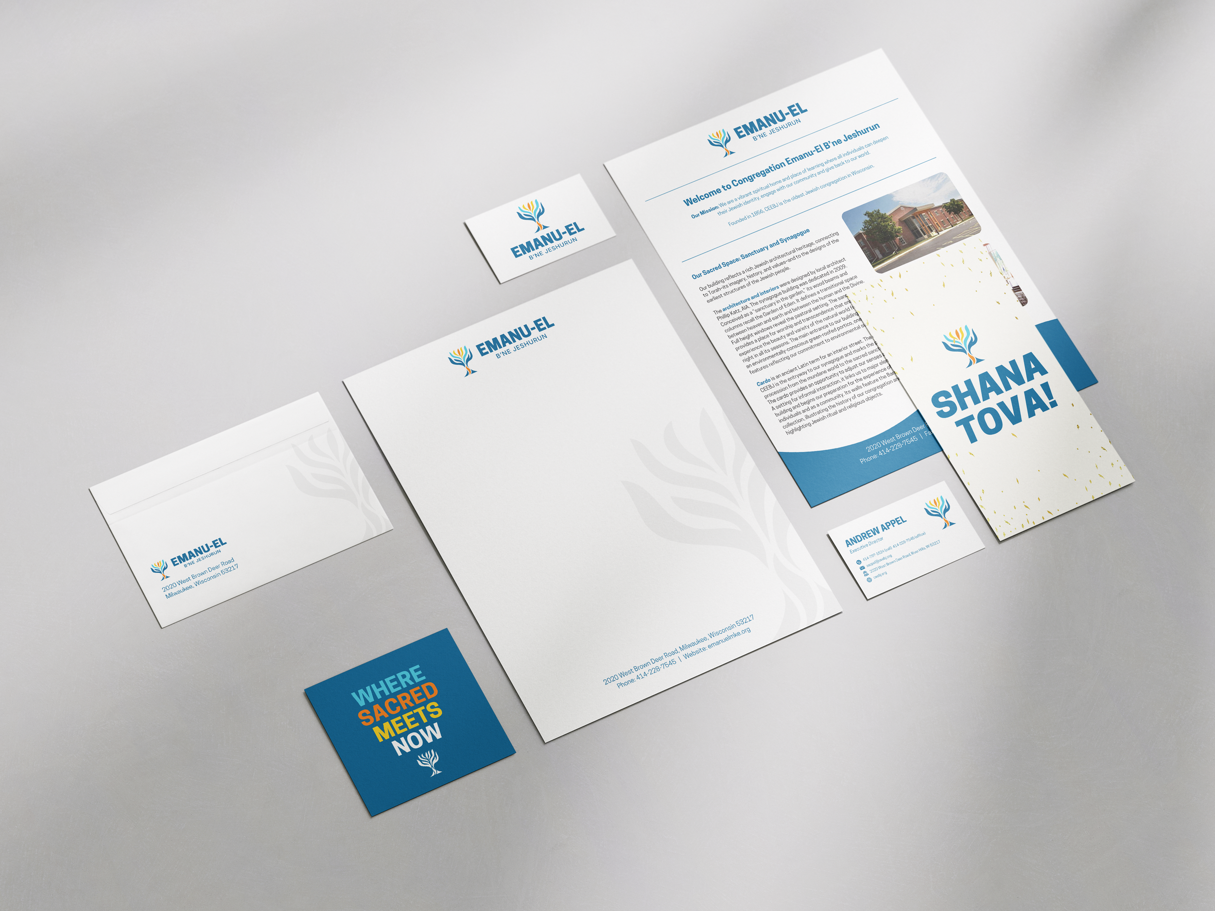
Naming & Brand Platform
We treated naming as a strategic act, not a cosmetic one. Emanu-El B’ne Jeshurun was reaffirmed and clarified as the primary name, not shortened or modernized out of existence. Instead, it was repositioned with intention and supported by a clear brand platform: Where Sacred Meets Now.
The platform holds history and present-day life in the same breath. It welcomes seekers without diluting meaning and gives the community a shared language for belonging, growth, and relevance.
Visual Identity Grounded in Legacy and Becoming
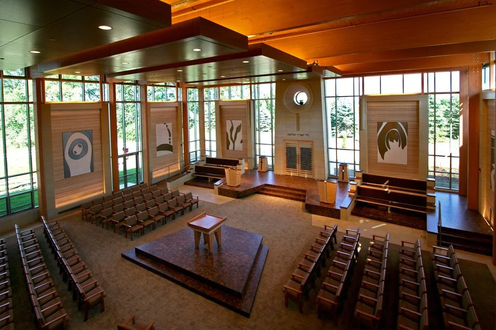
With the strategy in place, we built a visual identity designed to carry the weight of legacy while signaling forward motion. At the center is a new hero mark inspired by a historic relief from the congregation’s former home. The tree form symbolizes growth, continuity, and welcome, with upward movement that suggests becoming rather than arrival.
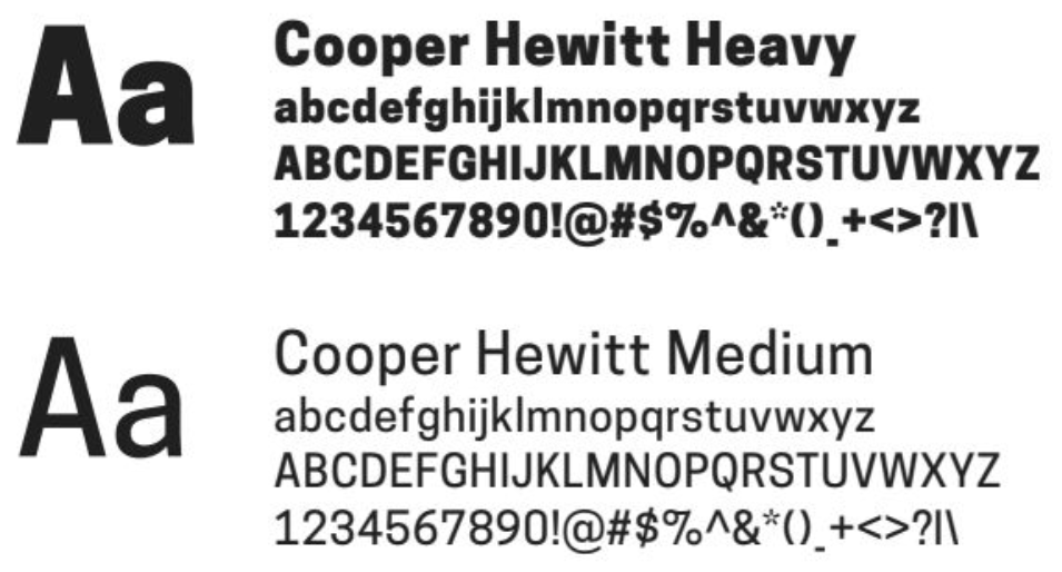
The full system includes a primary logo built for longevity, a modern typographic system balancing clarity and warmth, and a vibrant color palette rooted in place and community energy. The
Digital Experience
The brand system was extended into the UI design for Emanu-El’s new website, ensuring the digital experience reflects the same sense of warmth, clarity, and accessibility as the identity itself. The site supports storytelling, discovery, and connection, meeting people where they are and inviting them into what’s next.
FONT
COLOR
Flame Orange
#f58320
Harbor Blue
#0e6b98
Festival Yellow
#f6cb26
Sky Blue Pier
#50c7e1
River Walk Charcoal
#333333
Results
“Testimonial”
xxx

Looking to build a brand that can scale without losing its soul?
We help organizations turn mission into clear, cohesive brand systems.